Creator Clash!
(edited)

CREATOR CLASH! Two Summery Pieces to Warm Your Creative Spirit
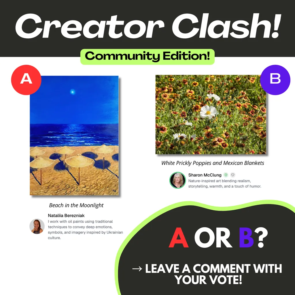
Two artists from our Community. Two Summer-themed pieces. Cast your vote in a comment below – and let us know WHY!

For a closer look at the art:

👉 Beach in the Moonlight by @Nataliia Berezniak

👉 White Prickly Poppies and Mexican Blankets by @Sharon McClung

Be sure to follow both artists to thank them for their courage in participating in our first ever Community Edition of Creator Clash! 💪

Both participants will get 500 Reputation points, plus an additional 500 to the winner!

36

97 Comments

Sort by:

It would be good to have people in the same genre- two photographers etc.

13
Translated from Español

Yes. I have the same conflict.

2

My choice is A. I enjoy the moon lite beach, and the contrast between the beach colors and the water. The B is also well done, its so peaceful.

2

I like A. To me it has repetition, great color, and it tells an interesting story.

2

I'm picking A for one reason. It tells a stronger story, made me think of why I go to the beach, which also jerked loose a few smells of the beach I miss,such as the pungent tang of melting tar under the boardwalk, and a dozen or so food wiffs. Thank you, Natalie, for the memories!!

2

A is my choice. It was a difficult one because both pieces are beautiful and convey the feeling of summer very well. The deciding factor is that flowers can also convey Spring or Fall, while the beach with sun umbrellas is almost solely Summer. With Sharon's, I adore how there are just a couple white flowers in the fields of darker colors to really make them the focus. In Nataliia's the simplicity of two colors works very well with thr simplicity of the subject.

2

My vote goes to A. The color are clear, very beautiful and used on the best possible way to bring smell and sound of the waves.

1

I'm drawn to blue in A. Love the shadows of the umbrellas.

1

Beach in the Moonlight is my choice. The bands of color created by the sky, water and sand and the pattern of the umbrellas and shadows has a calm focus which resonates with me.

1

A, I enjoy the pallet!

1

They are both beautiful. But for me it's A. It reminds of a relaxing vacation, a time when you can freely admire the scene and beauty of the ocean without any outside worries. The image on the right looked like a photo (I didn't click on it for a closer look or anything). It is also very pretty but I feel like painters should be grouped with other painters and photographers with photographers.

1

A is my choice because I tend to go for paintings over photos - but both are lovely!

1
Lee8h ago

A. Beautiful colours

1

Summer theme is all they have in common. They are both wonderfull for different reasons. One creates a memory of a place and relaxation. The other a recognition of small wonders. Great job to both!!!!

1

I genuinely feel like both are incredible in different ways. I prefer not to vote (and deleted my previous vote for that purpose) like that because I feel all art is equal if we put our effort into it. I love A because it provides a sense of nostalgia (with the cooler colors, even with the beige). Cooler colors are scientifically proven to reduce stress, so it's actually healthy to look at images like this! B is a different kind of piece, it attacks you with different divergent colors and I love it! I honestly see it having a theme of standing out, uniqueness. I know it's simply flowers, but I see the white poppies having to face a world of mostly mexican blankets (funny interpretation!).

1

I like A. It perfectly represents summer. It has wonderful colors and really takes you on a journey with all your senses.

1
Translated from Français

Two different exercises, chosen for the summer theme in retrospect of their creations.

A / quiet night by the sea. The moon is up, but it is not she who provides the light. The light comes from our right and floods the beach and its parasols like a sun. Perhaps a tad too far, without a shadowed area before the waves to be only an artificial light like a streetlamp, but then I remembered the very first impression and I read the short introductory text of the creator: Ukraine. Exactly the sensation that the first glance had suggested: the Ukrainian flag depicted differently than by its wheat field under a sky of azure. Bravo, beautiful, engaged creation.

B/ Here we have a photograph with a maelstrom of greens and yellows/oranges where a few white flowers delicately stand out. The photo is very delicate, very well framed with the main white flower slightly off-center and a few others leading the eye toward it. However here summer is no longer so green; the sun has for many decades burned everything well before July—perhaps up there in the Alps I could find this field of flowers. For me this abundance of flowers is more spring-like than in the heart of summer while remaining a beautiful photo, very successful and a call to the preservation of Nature.

Congratulations to both of you for your engaged works — one for Ukraine and the other for Lady Nature. It’s more that I will remember from your creations than the evocation of summer.

1

I chose A, I like the contrasts and the emotion given by the " trail " made the moon on the surface of the water, as if it wants to make a connection between it and the beach

1
Translated from Français

 for the colors and the composition

1

They are both beautiful paintings

1
Magdalena 15h ago
Translated from Português

B

1

Both of them are beautiful in their own ways. But as an Artist/painting/ I'm going to choose A. Because I know how hard we work to do such kind of a beautiful painting.

1

I really like A because it is a bit strange/other worldly. I mean this in a good way. It just captures my interest more but this is purely taste. B feels more realistic.

1

B as the flowers speak to me more than the beach.

1
RLPries21h ago

I feel both are incredibly successful in creating a summer vibe-- one, the dog days and the other, the moody nights. I like the composition and palette of the flowers but I'm drawn in by the drama of the nighttime beach. And I like the dual light action between the soft glow of the moon over the water vs what i imagine is that traditional flood light beaches are equipped with to keep people safe at night coming from the foreground and sending the shadows of the umbrellas in the opposite direction. Very effective. So I'm going with B.

1

I would choose A as it has impact with both the composition and the use of colour, the opposites of the colour wheel, also representing the colours of Ukraine.

1

B

Summer is when sunshine brings life to flowers.

1

I'm going with A, both are fantastic paintings, but I do love beachy ocean scenes.

1

B

1

A

1

B - I really like the duotones and the cleaner composition

1

A.....I love the composition! The shadows, everything!

1

I like them booth.

However, I like the colors of A vs B.

So, A it is.

1

I love both, so it would be good to put up some like for like pictures so we could properly compare! By the way - how do we enter?

1

A, it's actually a beach scene. Seen in moonlight. Very beautiful

1
Maddie1d ago

I love the feel of both images. The solemn feeling of the empty beach creates a tranquility vs loneliness. But the pop of white in the flowers is emphasized by the line of smaller adjacent white flowers creating a flow of a rolling meadow. It feels like a visitor in a foreign land during a carnival. Both are beautiful for their own reasons. But the blue in A is so visceral with a limited pallet, so I have to go with A.

1

I am going to pick A because of the stronger compositionand color choices. However, choices for photographers are limitedto the natural world. Don't compete photography against Painting.

1

I’ve seen many abstract photographs. Some photographers think outside the box. Depends what they are interested in.

1
Ted Smith1d ago

Okay, this is nit picky, but why do the umbrellas have shadows that are facing toward the light source?

I’d go with B as the composition in A is confused.

1

A

1

It's really not fair to compare the two, as one is an oil painting and the other is photography. Both are equally well done in their respective mediums.

1

First reaction is that summer brings to mind the beach while flower blooms speaks to spring. @AmarSingha gives a strong case for B, however living near the coast most of my life my bias causes me to vote for A.

Just curious as to how are images chosen for the creative clashes?

1

A really captured my imagination. I see the umbrellas and their shadows as moons on the sand. This is a surprising choice for me since wildflowers are one of my favorite subjects to capture.

1

I love them both. But I chose A Artwork.

1

Both Very Cool - - - A

1

I can not afford it

1

It would have been better with two artists in the same genre. My choice is A. Both artworks are beautiful, for me the story A tells appeal more to me.

1

B greaat bdetail

1

My choice is B. While the beach definitely says summer, here in the PNW flowers are the first indicators of summer before the beaches warm up.

1

I’m casting my vote for B. While both pieces are beautiful, I find the comparative relationship to the theme of summer stronger in this work. Because it bears the mood of summer by introduce the new green grasses, smiling flowers, prefacing a vast airy field that brings the freedom and joy of summer. The problem is in the choice of two pieces. Both are excellent in their own perspective, but usually, the Option 'B' convey the sense of summer more closer while the beach in the moonlight offers a lovely calming vibe of the summer at night. From a perspective of an artist, It's more emotional, and romantic that does not the focal point of this comparison.

1

I'm picking B beautiful flowers that was beautifully done brings back Lovely memories for me

1
CREATOR CLASH! Two Summery Pieces to Warm Your Creative Spirit by Taylor Sinople