Battle of the Waves – Vote for Your Favorite!
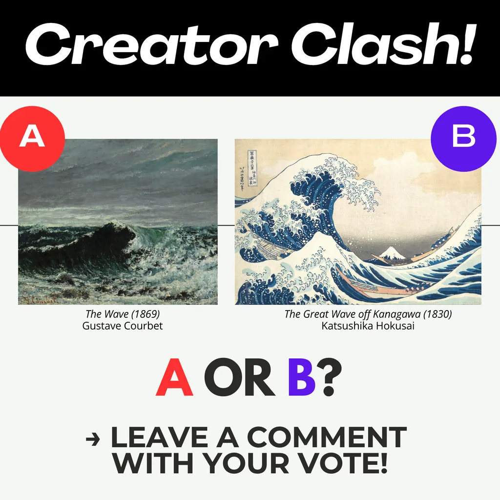
Today's Creator Clash brings us a face-off of epic portrayals of the wrath of the sea.
Vote for your favorite by commenting "A" or "B" below – and let us know why!
Posted in Creator Clash! (edited)
25
Today's Creator Clash brings us a face-off of epic portrayals of the wrath of the sea.
Vote for your favorite by commenting "A" or "B" below – and let us know why!
Forty two comments and people are sharing stories of standing in galleries absolutely transfixed. My vote is A, entirely because of Mary's story about being enveloped by that Courbet for thirty minutes straight. An artwork that makes you lose track of time like that deserves a win.
A. Even though I love the movement and colors in B, A provides more emotion for me. Emotion is more of a memory recall trigger for me than anything else.
Courbet did many versions of "The Wave." It was one of his favorite subjects. And I was fortunate enough to stand in front of a vertical version of his at either the Met in NYC or the Legion of Honor in SFO (I forget). (The one you have pictured here is not his best version IMO.) NOTHING. NOTHING prepared me for the experience. It was huge. It enveloped me, I felt tossed by the water, I could hear the wind blow and the waves crash around me. The chaos of the wild ocean was extraordinary. I must have stood there for 30 minutes just spellbound.
Hokusai's is a great painting in a totally different style. But it doesn't transport me to the ocean. It makes me smile, but I don't feel the same sense of awe (despite having Mt Fuji in the center) that Courbet's work provided me.
My two cents.
A for me too. Something about the scale of that wave feels more honest, more like what it actually looks like when you are standing on the shore and the ocean reminds you how small you are.
B, I love abstract art. If I wanted realism, I would purchase a photo.
Fair point. Abstract work asks you to feel the wave instead of just recognizing one.
That raw emotional pull is exactly it. Some paintings you analyze, but B just hits you before you can think about why.
Realism matters when you're painting the ocean. You can feel the weight of that water in A.
Definitely B, it's excitingly positive in a very distinctive style that I had already contemplated before and I tried, unsuccessfully, to make my own version in that style. Option A may have well-chosen proportions, but it's dark and sad, the complete opposite of B.
[comment deleted]
Seeing it through a photographer’s eye makes sense. That rawness in A, the way the water moves, feels like something you’d have to be right there to catch.
I had the same experience at Mary and second everything she said here. "A"
[comment deleted]
[comment deleted]
"Explains every aspect" is a great way to put it. You can almost hear it. I photograph the Mid Atlantic coast and I still can't capture what that painting does with the curl and the spray in a single frozen moment. Some things painting just does better than a camera.
B for me is dramatic with an imaginative fantasy quality
B is my selection! I love the drama and emotion of The Wave, however, I’m drawn more to the design elements of The Great Wave off Kanagawa.
A. I like the realism of this one. Great colors with that foreboding sky.
B. I prefer the illustrative style and the composition is perfect!
B. I love Hokusai. Claude Monet had only Chinese art hanging in his house in Giverny, France.
I thought that guy was an AI bot, wait, no, I'm thinking of Claude Bonnet. Really similar names it is.
B- I don't know why? I really was 50/50 with these 2 images. This is my rendition of a wave.....
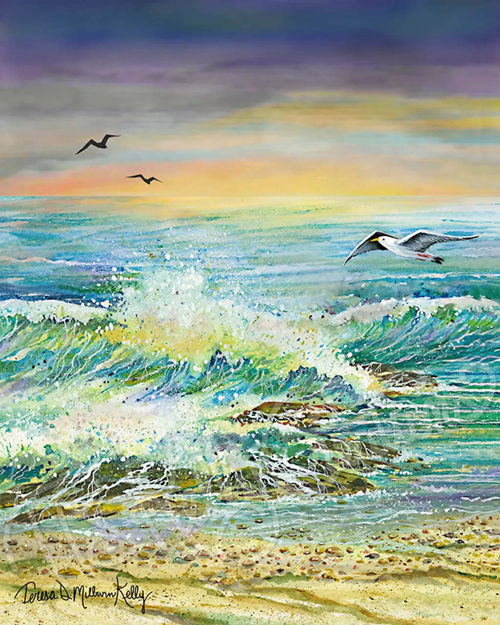
B
To my eye B contains far more energy, a far more visually-pleasing color palate, and the intense detailing you get from etching. They're both amazing, but for my money B is more so across the board.
B is my favorite, between dream and reality
B. I was just in Japan and bought a handmade tshirt that has B picture on it :-)
B - probably because I have seen it so many times in so many places.
B for me. Every time I see a painting of the ocean that actually makes me feel like I could get pulled under, it wins. That second one has that kind of raw pull.
I vote for "B". It is the representation of fury.
I will vote for B. I love how Hokusai made the details of this wood block.
Definatly a if the wrath of the sea is your theme . The other has A rather whimsical cartoony look which does really say look at me I'm dangerous where the other is realistic looking with the water almost black and scary
B is the wave for me but then I’m biased because I love Japanese woodcut prints. I wouldn’t say because it captures the wrath of the sea but because it’s simply majestic!
I'm partial to B.
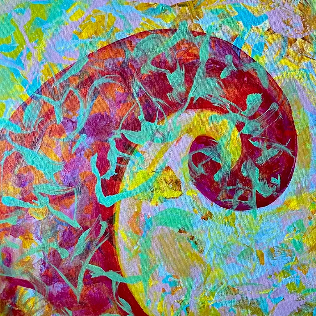
My homage to Katsushika Hokusai is kind of contemporary, and based on Fractal geometry. It doesn't have the great cultural significance that Hokusai has in his painting, its more decorative. Waves are one theory of light, and the interest in light has had me venture into Physics and Harmonics, both subjects have given me a 6 year old's comprehension of some of the reality that surrounds us. Also his woodcuts are beautiful and the art of the Japanese Edo period have influenced many Artist from the impressionists to today.
Wave “A” offers a feel of cold wet to me. There is no certain feeling in “B” for me. I like the wave of “B” as a strong force of nature but “A” is my favorite.
B because of the light... Winslow Homer is my favorite seascape painter. Contemporary seascapes I love Lana Ballot's work because the color is amazing!
B. Hokusai made the ocean feel like it had a personality. That wave looks like it could swallow those boats whole and never even notice. Courbet painted raw power, but Hokusai painted something alive.
I love the darkness portrayed in A - shows the danger and power of the ocean
A ,because Courbet in this painting, achieved a true breakthrough for his time. He didn't simply paint water; he conveyed its mass and inertia. Looking at work A, it seems as if you could reach out and feel the cold spray and rough foam. This is precisely why we love oil painting—its ability to be almost alive and tangible. Japanese graphics are undoubtedly brilliant in their laconicism, but they are more speculative. Courbet, on the other hand, is pure element of water.
The choice is very difficult! I like both: hypnotic images in which we get lost. But since I’m a fan of Courbet, I say A.
The Power of Flight and Light
I love this one! I've always enjoyed the sun shining THROUGH the waves, and this captures it completely. Absolutely beautiful! Thanks for sharing.
I want to vote for that one!!
Love this one! Powerful and beautiful! Love the colors. And yes, the visible light in the wave… spectacular!
that photo is quite impressive. How did you get it to stay up like that to photograph the light -just joking. Its so unusual.