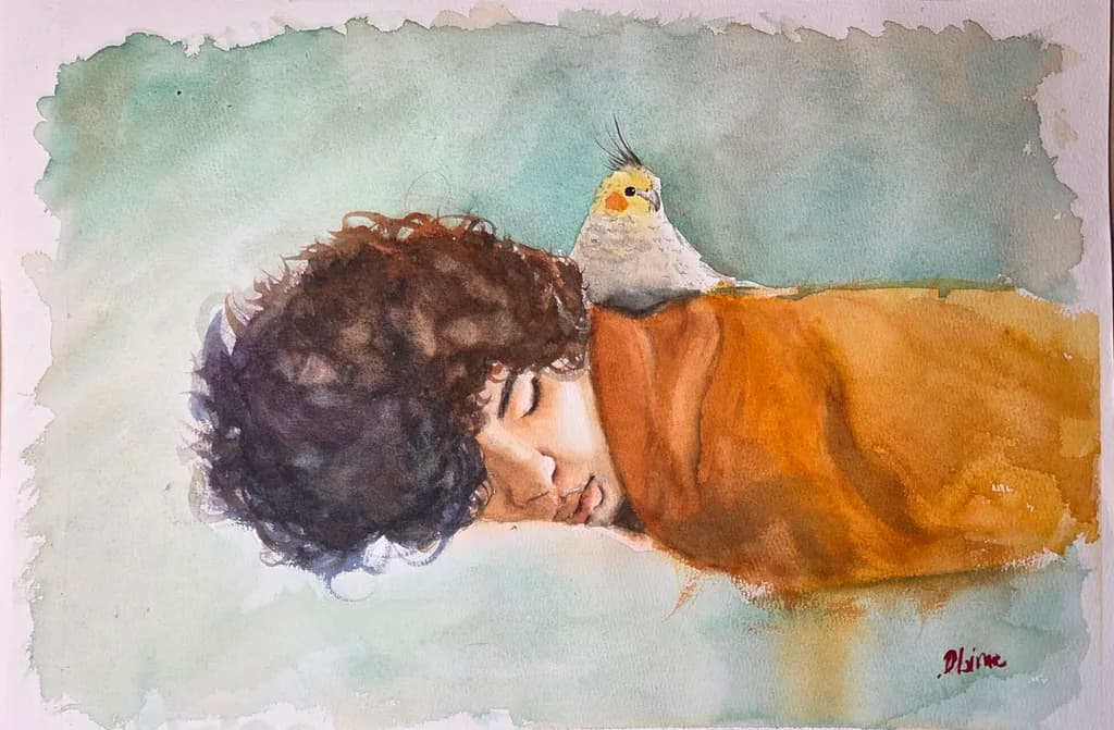
Hi everyone! I’d love some honest feedback on this watercolour study.
I want to make it in a A2 format, and would love some feedback before going to finish it :)
I’m especially working on balancing looseness with just enough detail. Any thoughts or constructive criticism are very welcome
Posted in Art Critique
2
The loose washes in the background feel right for scale, they read like atmosphere, like the kind of gradient you get when twilight hasn't decided what temperature it wants to be yet. If you're going to A2, that atmospheric quality will carry the size better than adding more edge detail would. What you have balances.
Thank you! This is really helpful, that’s exactly the balance I’ve been trying to understand